 Acadia Learning brings scientists, teachers, and students together in partnerships that result in useful research and effective science education.
Unit Overview
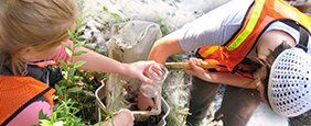
After being in the field, listening to water, looking at trees and recording location and sampling event conditions your students are now looking at a lot of data. They are about to look at numbers that came from the samples they submitted to the lab and put the numbers together with data about the site. Moving students from that physical sample to a number in a table to a point on a graph to a statement linking the data to the hypothesis is an extraordinary journey. And, like any journey, should be taken with single steps.
Some of the best tools for understanding data are graphs. They are useful tools because they graphically represent those numbers, from those physical samples, in a common two-dimensional field… and this allows us to see the information all at once, and to make conclusions based on that “seeing”. Having your students use their graphs as a tool, not simply a product requires some work in understanding the making of meaningful graphs and the reading of graphs.
The creation of meaningful graphs involves a great deal of material that is normally covered in a Math class. Think about the possibility of team teaching this unit with a math teacher, possibly as a project that would receive both math and science credit.
Rationale
Students need to be able to create graphs to help interpret their data and tell their research stories. More importantly, in school and in everyday life, students need to become conscious consumers, or interpreters, of information in a graphical form.
Objectives
Guide students to:
- Organize their data
- Read graphs and understand what they show
- Create meaningful graphs
- Analyze graphical data to determine relationships or differences
- Interpret data
Instructional Strategies
- Practice a Graph-a Day with your students
- Display a graph at the beginning of each class (or put on your moodle or another intra-class site as homework) and ask:
- “What do you see?”
- “What does this graph say?”
- “What more can you ask?”
- Display a graph at the beginning of each class (or put on your moodle or another intra-class site as homework) and ask:
This exercise should take no more than 5 minutes. Start with fairly simple graphs and work to graphs with more variability.
- Share the idea of variability
Ask your students to recall the sampling event. Discuss what might be different about their site now. Environmental data are inherently ‘messy’. There are many variables, or confounding factors, at play every second in every environment. The factors are often linked but will affect each sample a bit differently because never will all of those factors be exactly the same.
For example, if one variable is tree species and another is amount of litterfall, they might be linked—hardwood species will tend to have more leaves falling off than softwoods. Hopefully the study design in Unit 3 helped to record and therefore account for these confounding factors when feasible.
There will be many unforeseen confounding factors or variables you wish you had measured. Remind students that this information should be considered when trying to understand the data and may very well be useful when telling the research story at the end of the project.
- Use the research question and hypothesis as guides to keep the data analysis on track
Although exploring the data can be a great learning experience, students might eventually lose focus and need redirection toward the hypothesis. Asking something like, “What is the question you’re asking of the data?” will help redirect.
Use the hypothetical graph created in Unit 2 as a template or cue to what a data product—like a graph or diagram - might look like.
Although students may work on data analysis in separate groups, it is a good idea to compile all the data into one common spreadsheet or table so that each group has the same data to begin with.
Key Ideas Introduced in this Unit
- Environmental data contain many variables and they are often linked
- A graph is a visual representation of data analysis and a useful tool in science
- Judging whether or not differences are meaningful
Vocabulary
Learning the vocabulary to talk about data can be difficult. Here are some key terms you might begin to establish with your class, as you work toward final presentations:
- Mean
For our purposes, the average. Add all the values and divide by the number of values. Statisticians will tell you there are lots of types of means, but this isn’t relevant to our level of inquiry.
- Median
The middle value in a set of numbers. For example, of 3,4,5,6,7 – 5 is the median, the middle value.
- Variability
The spread of the data.
- Meaningful differences
When comparing groups, we want to know if the differences (if any) are large enough that they mean something in the real world. For example, if someone offered you $100.00 and someone else offered you $100.01, you really wouldn’t care which you picked – it’s just a penny. But, if someone offered you $100.00 and someone offered you $120.00, you’d probably want the $120 – it’s definitely more and the extra $20 makes a difference to you. Our data plots give us tools to help make the judgment whether a difference is meaningful or not.
- Correlation
The degree to which two things are related. For example, if bigger fish have more mercury, and this pattern is clear, we would say that mercury concentration and fish size are correlated. We talk about strong or weak correlations – strong correlations mean the relationship is very tight, whereas weak correlations mean that there’s a lot of variability in the data. Things may be positively correlated—as one thing gets bigger, the other gets bigger too) or negatively correlated—as one thing gets bigger, the other gets smaller.
Student Prerequisites
- The purpose of a graph and what it looks like
- Basic math skills (calculate an average, etc.)
Misconceptions
- It doesn’t matter what is the X -axis and what is the Y-axis
- Data can be put on a graph in any order
- Graphs are only used in math class
- All the data given should be plotted (as opposed to judging and choosing relevant data in a complex system)